I guess what would be most useful would be to not place them at the exact same spot! Both widgets worked (mostly) normally back in Android 11 when they weren’t stacked.
Oh well, I don’t really care (besides my annoyance about wasted screen real estate) since I never ever used the search bar, and the “At a Glance” widget is more a (malfunctioning) gadget than a really useful feature anyway. -shrug-
I actually got a message from support that this could be fixed in the latest update. @CircusJim may have gotten it too. That’s why I originally thought the note was related to this issue, and why I reacted the way I did:
I really hope the fix will make it into the next update.
This one is on me @Razem. I may have counted my chickens before they hatched when it comes to At a glance.
Widget randomly changes from one to the other - we have a fix in the pipeline for this. It was delayed so we could focus on security patches, A13 prep, fixing aptX, VoLTE settings… I can’t say when the fix will come out but it’s on the way.
Long-pressing the search bar shows At a glance preferences - according to our team, this is the default behavior of the search bar app provided by Google. It’s closed source so there’s nothing we can do about it.
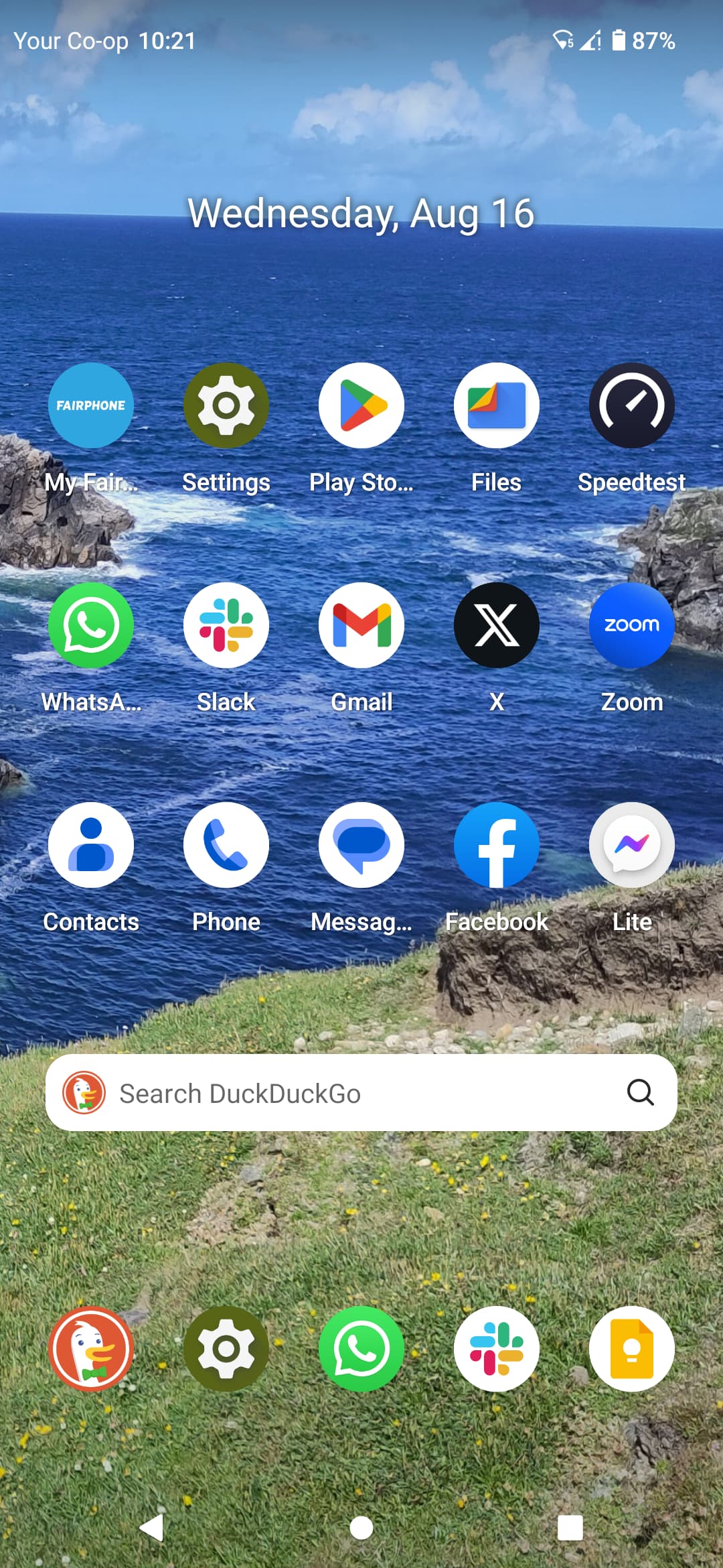
I don’t know if this is supposed to be a ‘feature’ or a bug, but after upgrading to Android 12, I now have an immovable widget(?) taking up five app spaces at the top of my home screen. On some days it’s the date and on others it’s a superfluous DDG browser bar, neither of which I can delete!
It’s both. In A11 the (irremovable) search bar was on the bottom, and there was a widget (“At a Glance”) on top telling you the date (and sometimes weather and such). As you see in your first screenshot.
With A12, both widgets got moved to the exact same spot (!), and since they are both irremovable, they fight for the spot and you get to see the winner, or at least its corpse…
As chantoine said above, the only way to get rid of them is to use another launcher, since they are both irremovable Google widgets (even if you can change the search to something non-Google thanks to European law).
If you don’t use the search widget anyway, you can at least get rid of the bottom one in your second screenshot, only the (dead) top one is irremovable.
This is more or less resolved by the Android 13 update. The good thing is that it no longer switches between two widgets. The bad thing (in my opinion) is that instead of the At a Glance widget, the search bar was chosen to be at the top. I’m not really sure if it’s the intended behavior and it definitely feels weird. I’m marking this topic as resolved, but until we have a definitive confirmation that this is Google’s intended behavior and not Fairphone’s design choice, I’ll mark it just as a workaround in the list of issues.
I’m rather confused by that statement. I have updated to Android 13 and can only see the date at the top of the home screen now. I consistently had a DDG search bar on Android 12 (without any fights for the top slot), which would be my preferred behaviour. Note that the Google App is not active.
It should basically restart your phone and prompt you to select your default search engine again. I’m curious if it lets you keep the DDG search bar or if it actually prioritizes the At a Glance widget.
I agree: At a Glance and Search each has its own settings. On a Google Pixel 6a running Android 14 long press on the At-a-Glance widget allows you to customise it (via Customise->At a Glance-> At a Glance config page), and a long press on the Google search bar brings up its search preferences.
I would ask the team configuring the standard launcher to check that the At a Glance widget is at the top of the (first page of the) home screen, and the Google search bar is at the bottom of (every) home screen page (below the fixed icons Phone, Messages, Chrome, Photos, and Camera). The Google search bar still hides the At a Glance widget at the top of the screen in build FP4.TP29.C.0101.20240121 and At a Glance (even as an added widget on another Home screen page) has never worked for me on my FP4. And on my FP4 the Google search bar has no settings to configure, at least not by a long press on another instance of the search bar on another home screen page.
OMG no! I do not use the search bar (Google or otherwise), never ever, so for me it’s just wasted screen real estate. Having it on the home page is already bad enough, I definitely don’t want it on the other 2 pages too…
As for the “At a Glance” widget, it never really worked for me, even back when it was not yet placed on the same spot as the search bar (IIRC that happened with A11).
It did display the date (wow!..), but it was unable to either display correct weather or my schedule (calendar). I replaced it with more capable widgets doing the same thing and definitely would like to can it altogether. Right now it’s like having a perfectly working cigarette lighter, but nevertheless being forced to also lug around a set of useless flint stones.
Well, yes, up to a point.
Ideally we should be able to control what appears on the home screen, and where.
If Google insists as a condition of access to the Play Store that there is always a search bar somewhere on the home screen, then pinning it to the bottom of the screen (below Favourite Apps) may waste the least space.
The At a Glance widget should be optional and if placed at the top of the first home screen page by default should be removable.
The search bar and the At a Glance widget should NOT be in the same place by default - that is a configuration bug by the developers and should be fixed!
Definitely.
I can live with one search bar on the home (first) screen, although it will be wasted space no matter where you put it. That been said, IIRC on my previous Samsung that bar was optional (but then again Fairphone isn’t Samsung…).
The “At a Glance” bar is IMHO pretty much useless, and unlike the search bar, I fail to see the monetary advantage for Google in having it. It should be optional, for those rare people who want it (I fail to see why, there are better widgets for everything it does, but all right, why not).
As about putting them both on top of each other, I agree it’s a bug, but it definitely suits me because it means less wasted screen space…