To help our community to get better visibility and support their work to promote fairer electronics we created a new design just for the community.
You can download it here as a .zip
Alternatively you can get it from the WeAreFairphone Github page.
It can be used by any community member for any Fairphone community related project. The design files are there to help you communicate your message and can be altered, improved and spread without any restrictions. The files are released under an CC-BY-SA 4.0 license.
The design is made with the scale of the community events in mind: small-scale and low-costs. The design should fit both on- and offline needs. This style-guides should be a tool for quick and easy way to set-up projects, connect with Fairphone values and identity, while remaining independent.
With so many new amazing project being developed by the community, from meet-ups, to repairs, to new websites and immensely active Facebook groups, we thought it would be good to make sure they can be easily recognized.
The new design also aims to show the strong link between the community and Fairphone as a company, but also make clear they are two different entities striving towards common goals.
The design consists of:
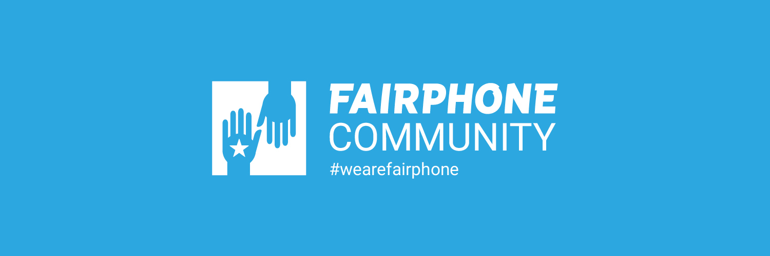
1. A unifying symbol: two hands and a star.
The logo tells the story about the relationship between Fairphone and the Community. The hands symbolize how we are giving to each other but also that we are sharing values and knowledge.The star is back, as the mark of the core values of Fairphone, shared from the rest member of the community to the new ones.
We’ve made it it two different formats; square and round, so you can use them in most environments.
You can use the inverted version on colored or dark backgrounds so it retains its visibility.
2. A typeface: Roboto and handwriting
For all content designed by the community, where typed text is needed, we will use the Roboto. Roboto was one of the original typeface in use on Fairphone website before the 2016 rebranding.
The use of handwriting is a way to bring a human touch in the identity. It may seems like an easy way out at first sight, but it is an authentic way to highlight the resourceful and crafty people of the Fairphone Community. Dif cult to use online, it is a true mark of the individuals behind the community when used in printing. Handwriting can also comes in handy when details of an event are not known yet while designing the your poster. It can be printed with blank space, and edited afterward by other people (and copy with a copy machine).
3. A system: align centre.
We added some examples on how you can build-up your design in the included files. Please look at them closely for the best way to distribute elements in a design.
We hope you all like the new design, use it to its full potential and share back here and elsewhere what you have made with it.
If you convert the files into other formats, please share them back here for others to use and build from!
Tusen tack, Dankje and merci beaucoup!
Emelie, Douwe and Gabrielle
 )
)


