Hi, my answer from the helpdesk came yesterday. So I guess my ‘quite’ period is over. It was a very kind and friendly answer, but a single question was answered. He only referred to the latest blog posts. So I assume they just cannot answer my questions right now because they don’t know themselves. That’s okay, let’s see if they can in the future.
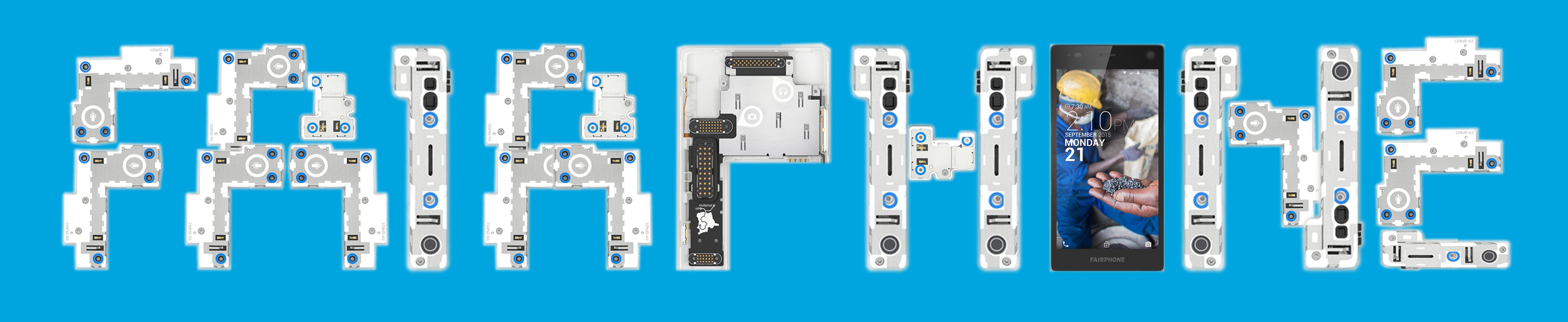
Here is the picture I wanted to post here before, I hope you like it. I can provide changes or .svg files or what ever is needed. The fonts are free fonts, the licenses look okay to me. (Fonts used quickly with no kerning or any microtypo: Google Roboto and Heart Breaking Bad font):
Whoa! Really love this! Will have a go at making a mock-up myself sometime soon.
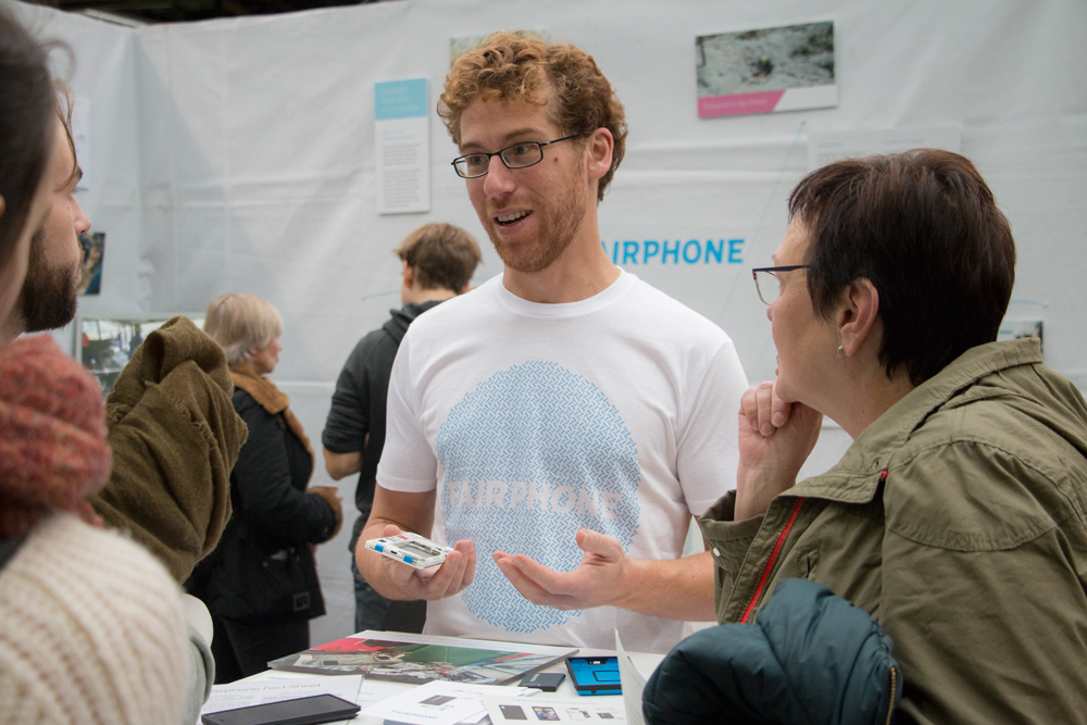
Did you peeps already see our new T-shirt design? Here is a picture of me wearing it in Berlin:
actually I think the t-shirt has a very nice subtle message; it is hard to see on this picture, but the blue circle is made of hundreds of small screws.
But as goes to show; it is hard to argue about taste. All the more reason to continue on a community designed t-shirt!
My initial reaction to the white shirt which Douwe was so kind to provide me with for our latest Aachen meet-up isn’t completely enthusiastic either, but I don’t want to give an ultimate verdict yet. What I do want to say is that, as Douwe said, it is quite subtle – which makes it the opposite of the previous shirt which was (is?) quite bold, both in terms of hue and the contrasting stark letters. I can imagine some fans and some Fairphone staff might have found the blue one too “in your face”, so it is good when there is an alternative option. But I think both options should be there – in other words, please keep the bold blue shirt in print … too
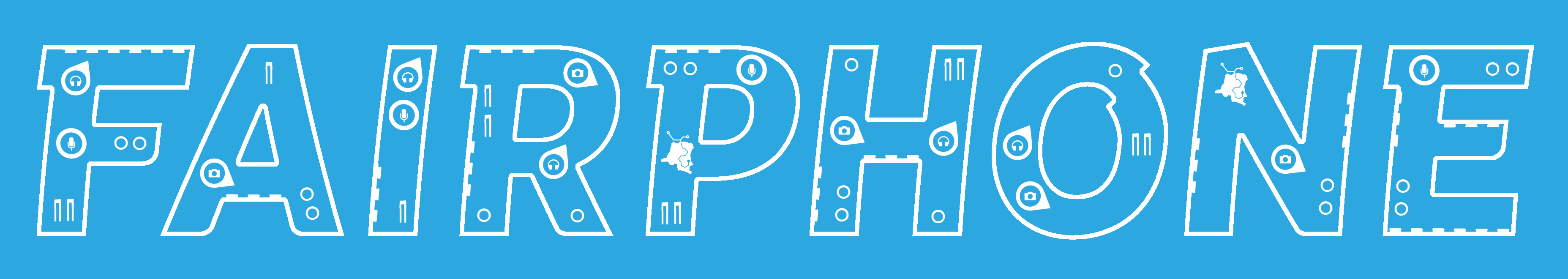
I am sure I am not the first one who has had this idea for some time, but given I had nothing better to do this friday night (well, I would not call the dish-washing that is threatening me “better” … ) I thought I’d finally visualize it. Be forgiving, I know it’s not the most elaborate rendering, but I just wanted to put it out before it’s never brought up at all. There is definitely someone out there who could make this much more professionally. Again, I’m sure others have had this idea, too. Older folks, please stay away from Commodore-64 jokes.
I like it a lot. The FP1 in there is also a nice idea. Not sure how well all the fine details will work on a shirt, but font-wise it looks perfect! Maybe it’s a good idea for a postcard as well?
Oh, of course I made fit what would not fit I trimmed, overlapped, squeezed and stretched.
The idea was to make a sketch, not a blueprint, so I used solely the background graphic at http://www.fairphone.com/wp-content/uploads/2015/07/Story-FP2Render.jpg In my opinion, should this idea ever be considered for anything from Fairphone, there would be two ways to craft a proper blueprint: Either try to use all available FP2 module shapes (not just the 5 or so I cut out of the background graphic – your iFixit suggestion is very good as they provide some of the most lavish FP2 module photos around) to approximate the original FAIRPHONE lettering as closely as possible – or develop a “FP2 module style” for filling the letters, i.e. a style that uses the grey base, the white edges, the blue and white circles and so on, but won’t insist on sticking to the exact shapes of the existing real life modules.
Nice wordplay, but the Fairphone as such isn’t “fair”.
It may be fairer than other phones, but imo not to an extent that warrants bold statements implying that the FP is fair in an absolute sense and other phones are not.
In my opinion stressing specific accomplishments as in some contributions above is the way to go…
More as a post scriptum rather than an actual suggestion, I did try to proceed from my initial idea I uploaded here three months ago. There are quite a couple of design challenges anyone encounters when trying to draft a Fairphone T-shirt, the two biggest ones in my opinion:
When you look at it closely, the Fairphone font reveals it is not based on straight, but bent lines. If you want to photoshop around the Fairphone signet, this complicates the whole thing considerably.
Plain and simple, I strongly assume Fairphone only prints T-shirts using one colour. That’s what rules out my initial idea, but made me think of the “stylized” approach earlier on.
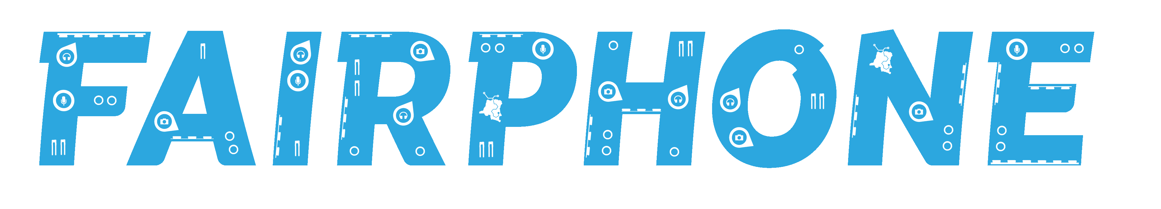
Now I gave my best to pursue the “stylized” approach, but frankly all that came out of it looked dull:
Again, if someone still likes the idea and is a proper (or just a better amateur ) graphic designer, I’d love to see what you can do with just the idea and your superior skills!


 I trimmed, overlapped, squeezed and stretched.
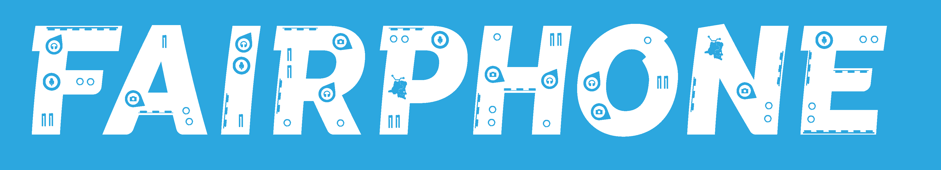
