Sorry to hear you’re disappointed. We did a lot of testing and bug fixing of the website before launch, but in any development project there is still things to fix after launch.
We’re collecting your feedback and I hope to respond to specific points in a bit. Thanks for your patience and thanks to everyone for the ideas so far!
The standard font in Support articles is hard to read (very lightweight) in Firefox, Chrome and Opera (Mac 10.11.6). It’s better (more legible, but not great either) in Safari.
Here’s how it looks in my Firefox (please click to enlarge):
I’m experiencing issues with the RSS feed of the blog (Fairphone). In the last few days my reader (Liferea) is lamenting the following parsing error:
Could not detect the type of this feed! Please check if the source really points to a resource provided in one of the supported syndication formats!XML Parser Output:
The URL you want Liferea to subscribe to points to a webpage and the auto discovery found no feeds on this page. Maybe this webpage just does not support feed auto discovery.Could not determine the feed type.
You may want to contact the author/webmaster of the feed about this!
I figure you must already be aware, or not, or maybe it is a problem on my setup, still, wanted to ask.
Have a nice day.
PS
I gave a decent onceover at this thread and a few other and found nothing relevant. I’m not usually the type who only looks for a few minutes to see if a issue was already reported/discussed, therefore I apologize in advance if this time I let laziness get the best of me.
I am often here by my Asus eee and my browser-window is normally only 860 pixel wide. Until now I had no difficulties with the forum, but now the lines are too wide and I get a horizontal scrollbar. My observation: there must be a display-border set in a css-file. If I make the browser-window 880 pixel wide, something changes, the wordwrap is activ and the scrollbar disappears. The wordwrap should stay on as long as possible for smaller displays.
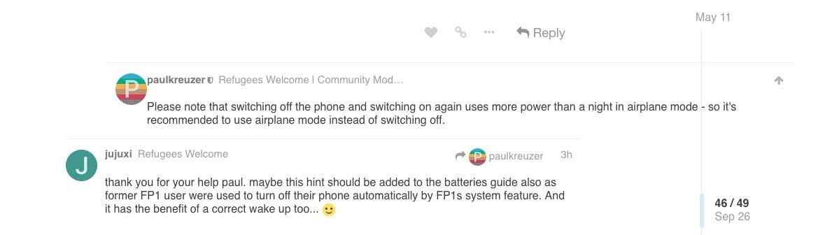
If someone replied to a post you can tap in the top right corner to see the post that they replied to. Now in the top right corner there is an up arrow that should take you to that original post, but since this arrow is behind the topic progress slider, tapping there will actually take you somewhere else within the topic.
In the example below it will take you somewhere between May 11th and September 26th.
I am a bit surprised there is not yet CSS fix for the forum… 7 days after our first feedbacks and after a “lot of testing and bug fixing of the website before launch” as @anon90052001 said .
It should be easy and quick to solve… what happens ?
The convenient https://fairphone.com/asksupport link to the support form currently links to the main support page instead of the support form. Is this an intentional change?
Ok guys. Sorry for taking long to respond to your feedback. Tried to roll out some .css fixed myself after the launch, but it might have done more harm then good. I have now collected everything and will be discussing it with our developers this afternoon.
Depending on when we can build a new .css based on the new brand style, I will discuss with Douwe if it might make sense to roll the forum back to a default discourse theme in the meantime so at least everything works functionality wise.
This would also allow the dev’s to test the new theme before re-launching it.
If you see a topic “liked” by me in this thread, you know I have read, understood and captured it as a bug on our backlog.
I will also reply to a few specific questions after this post.
My apologies for this, I underestimated how much the forum .css was depended on the old website being accessible. We’ll try to fix it as soon as possible.
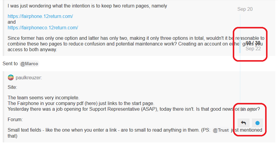
I had something to do with the decision, so I’ll try to explain it. There are very different logistics flows behind repair and behind cool off and DOA returns. In the future we might even more actually. At the moment it is not doable to switch a RMA between one of the flows in case the customer chooses the wrong one.
So we decided to prevent mixups 100% by just keeping it two separate portals. In terms of maintenance the impact is not so big for us, as instructions for returns are very different from repair anyway - and as I just said - the flows are also different.
Aaa @Johannes now I get the issue. You are totally right! I was even the one who thought up it might be practical to have a link that takes you directly to a new ticket request…
I’ll see if I can revert it back to the old situation, I like it more.
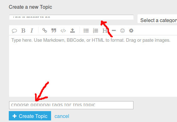
It is impossible to enter / edit the title of a new topic because the title field completely cripples the font. The same applies to the “choose tag” field as long at it is empty. However once an existing tag is selected it will be displayed readable.
Just to add: The “add hyperlink” dialog suffers from the same problem: unreadable fonts in the input fields.
Desktop operating system: XUbuntu 16.04 and Firefox browser