Congratulations, Joe, for getting it done after all
One minor observation: On the blog, you note that
the new Fairphone.com uses a simple top-level navigation of Fair, Phone and Community.
The three top-level menus don’t fully correspond to that (reading Phone, Story and Community). Intended or typo?
And thank you very much for showing
“normal people” (not models!)
One of the things that I resent most about advertising featuring the usual models is the underlying suggestion that we’re supposed to worship flawless superhumans, and I am so grateful that you are not going for that.
The width of the main container of the forum is strange. At home it is fixed to 62.5rem. 100% will be better.
<div class="row">            ---> width:62.5rem;
    <div class="full-width">      ---> supposed to be width:100%;
      <div id="header-list-area">
        <!---->
      </div>
    </div>
  </div>
There are also other some minor css adjusment requiered (in the forum) (ie : open/close arrow when editing a post, recovered by the browser scrollbar; thread tags overflow the header,…)
I am still adapting to the new layout, especially on the homepage. I’m honestly not so much into this Windows-10-like “Let’s make everything flat” thing, but that’s just my opinion.
Two thing:
Since Germany seems to be the biggest Fairphone market, you should probably mention 1&1 as currently the biggest FP2 retailer in Germany.
Since former has only one option and latter has only two, making it only three options in total, wouldn’t it be reasonable to combine these two pages to reduce confusion and potential maintenance work? Creating an account on either gives you access to both anyway.
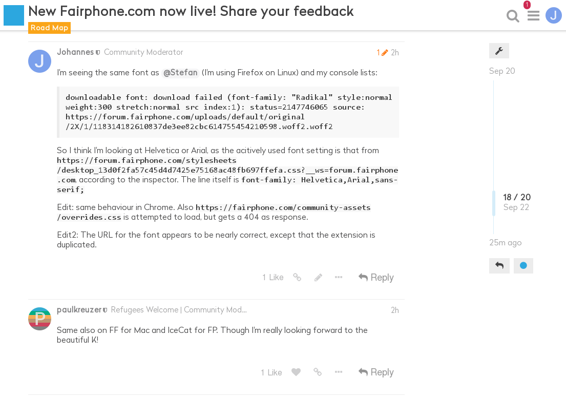
So I think I’m looking at Helvetica or Arial, as the acitively used font setting is that from https://forum.fairphone.com/stylesheets/desktop_13d0f2fa57c45d4d7425e75168ac48fb697ffefa.css?__ws=forum.fairphone.com, according to the inspector. The line itself is font-family: Helvetica,Arial,sans-serif;
Edit: same behaviour in Chrome. Also https://fairphone.com/community-assets/overrides.css is attempted to load, but gets a 404 as response.
Edit2: The URL for the font appears to be nearly correct, except that the extension is duplicated.
Edit3: Presumably this is what should look like (I used the style editor in Firefox to apply some overrides):
Sorry to hear you’re disappointed. We did a lot of testing and bug fixing of the website before launch, but in any development project there is still things to fix after launch.
We’re collecting your feedback and I hope to respond to specific points in a bit. Thanks for your patience and thanks to everyone for the ideas so far!
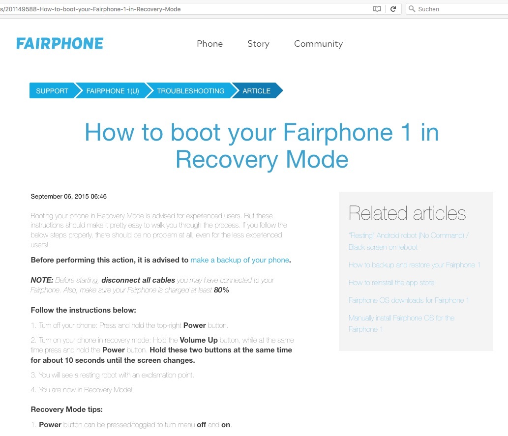
The standard font in Support articles is hard to read (very lightweight) in Firefox, Chrome and Opera (Mac 10.11.6). It’s better (more legible, but not great either) in Safari.
Here’s how it looks in my Firefox (please click to enlarge):


 missed
  on OS X 10.11.6