No, don’t! This design is so much better and it’s not like a few errors can’t be fixed right?
Yeah, this design feels much more Fairphony!


I think the “About” button should be below #uncategorized.
Stuff that should be fixed now:
- Headings are not bold (#### Headline) / All text is bold
- The Flare that accompanies an avatar (Fairphone F for employees and Angels) is in the wrong place.
- Top bar of postings is empty
- The settings button in the editor.
The other issues are going to be looked into the coming two weeks.
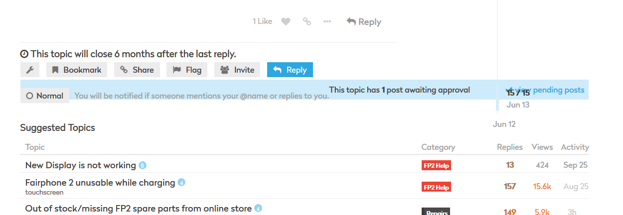
Most design issues should be solved now. Please report here if you encounter more.
The quote button works only about 50% of the times I click on it. When I already have an edit window open, it works always.
PS.: Tested on post #22.
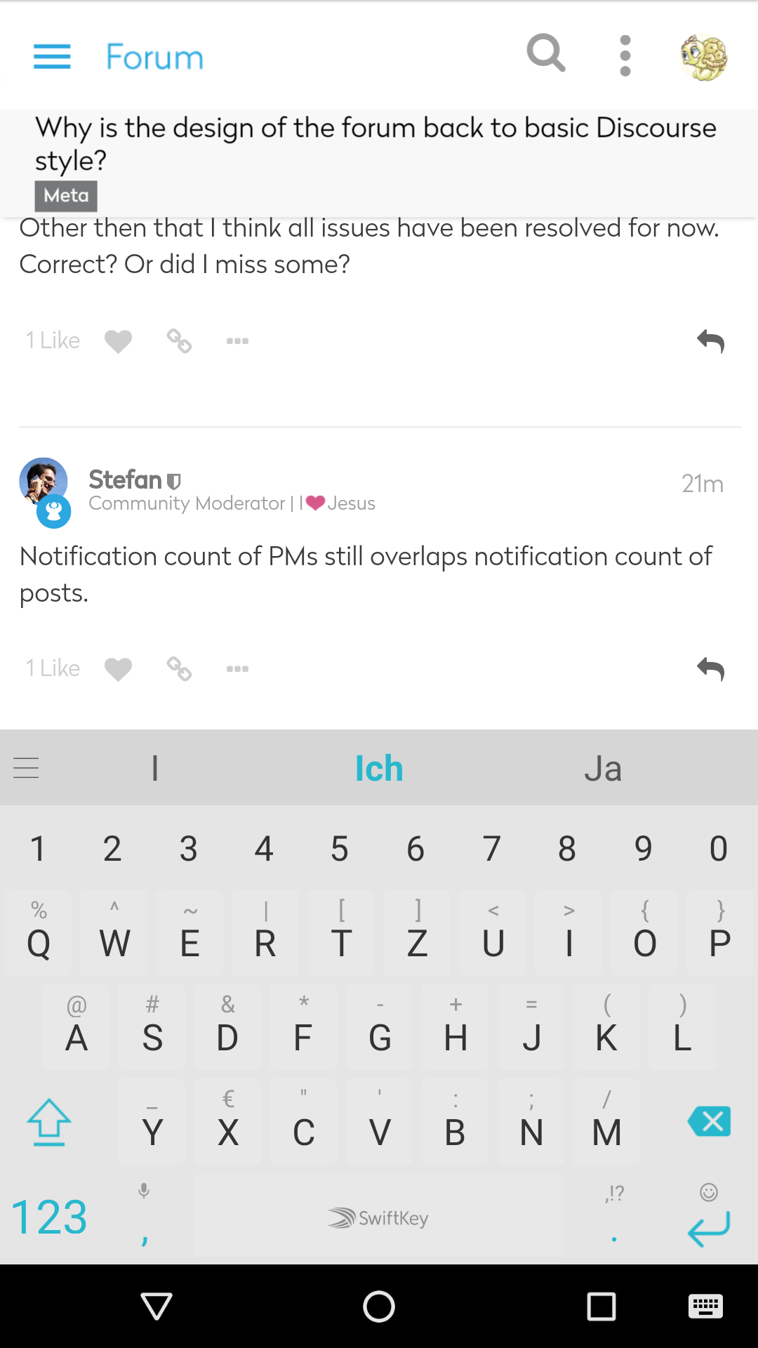
The quote button bug will be looked at in the near future. Other then that I think all issues have been resolved for now. Correct? Or did I miss some?
Notification count of PMs still overlaps notification count of posts.

Discourse doesn’t even support Firefox Mobile, geschweige denn Lightning.
You can check wheter it’s the theme’s fault or Discourse’s fault by switching to the old theme in your preferences.
Close, but not there yet. 

Edit: Firefox 57
@anon58277610 did you see this?
Nice try.

Edit: For reference, it should look like this: (Mickey Mouse)

Old theme
A lot of buttons don’t work for me on mobile.
E.g: I can’t move posts, open/close topics or see the post earlier in the thread someone replied to.
Other buttons only work when you tap exactly the right spot.
E.g: On desktop I can tap on someones name to see their profile, on mobile I have to tap the avatar.
@Stefan even if it’s not the good design, the current quick fix is a working solution 
@paulakreuzer can you give me some informations related to your environment to be able to investigate more? (browser version, etc.)
NB: I quickly updated the CSS to get the Mickel style… I hope it’s now working.
Sure:
- Fennec F-Droid 57.0 (based on Firefox)
- FP2
- latest official Lineage OS with current modemfiles
But I just tested and it’s the same on Kitkat FP1’s standard browser.
PS: It’s gotten a bit better (or I have gotten better at tapping at exactly the right spot), but one thing that still absolutely doesn’t work on mobile is tapping to see the post that someone replied to.

Some people ( ![]() ) don’t use the quote function (or they can’t because they are on mobile - this actually never worked), so I have to scroll up the topic and guess which post of the person indicated by the in-reply-to-symbol it was a reply to.
) don’t use the quote function (or they can’t because they are on mobile - this actually never worked), so I have to scroll up the topic and guess which post of the person indicated by the in-reply-to-symbol it was a reply to.
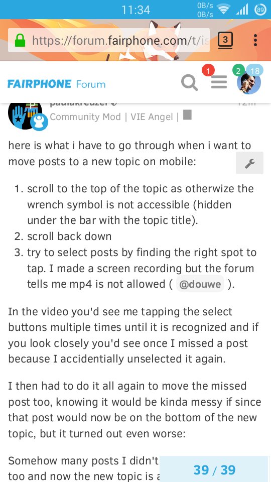
here is what i have to go through when i want to move posts to a new topic on mobile:
- scroll to the top of the topic as otherwize the wrench symbol is not accessible (hidden under the bar with the topic title).
- scroll back down
- try to select posts by finding the right spot to tap. I made a screen recording, here is a gif:
If you look closely you see I missed a post because I accidentally unselected it again.
I then had to do it all again to move the missed post too, knowing it would be kinda messy if since that post would now be on the bottom of the new topic, but it turned out even worse:
Somehow many posts I didn’t select were moved too and now the new topic is all messed up.
Btw: Also when I tried to move the last post to the just created topic I couldn’t find it when I typed in almost the whole title - I the reduced my search phrases to 2 words to find it.
Oh and shouldn’t we rename this topic? The title isn’t current at all anymore.
The user description is cut off at max-height: 60px, when it should be 3xline-height (see corrected CSS below):
#user-card .bio .overflow {
    max-height: 72px;
    overflow: hidden;
}
The input box for the user description is also rather low
This setting is relevant though I’m not sure what else we break with this change:
.d-editor-input, .d-editor-preview {
    ...
    flex: 1 1 100%; /* remove this */
    ...
}
@anon79757119 Could you have this fixed, please? 