Do more users see this issue with the new FP logo?

Continuing the discussion from Fairphone's next chapter starts now:

its already some time ago so expect now the transition Hik-ups should be resolved.

I see all this kind of thing happening on multiple places:

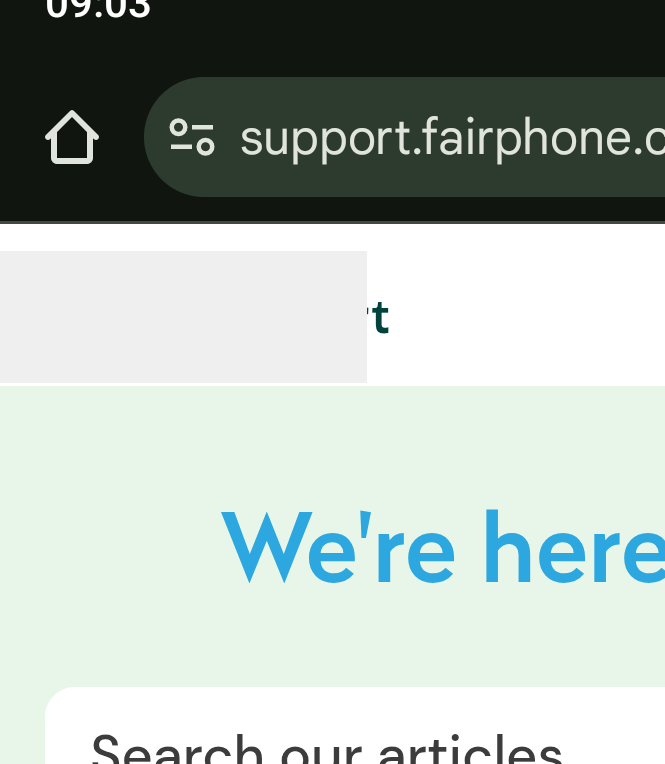
i asking here just to know if its not some kind of problemen inside my browser. before contacting Fairphone unnecessary for a not really important problem. :wink: it only looks bit unprofessional.

greetings

Tom

3 Likes

Looks good to me with Firefox on PC

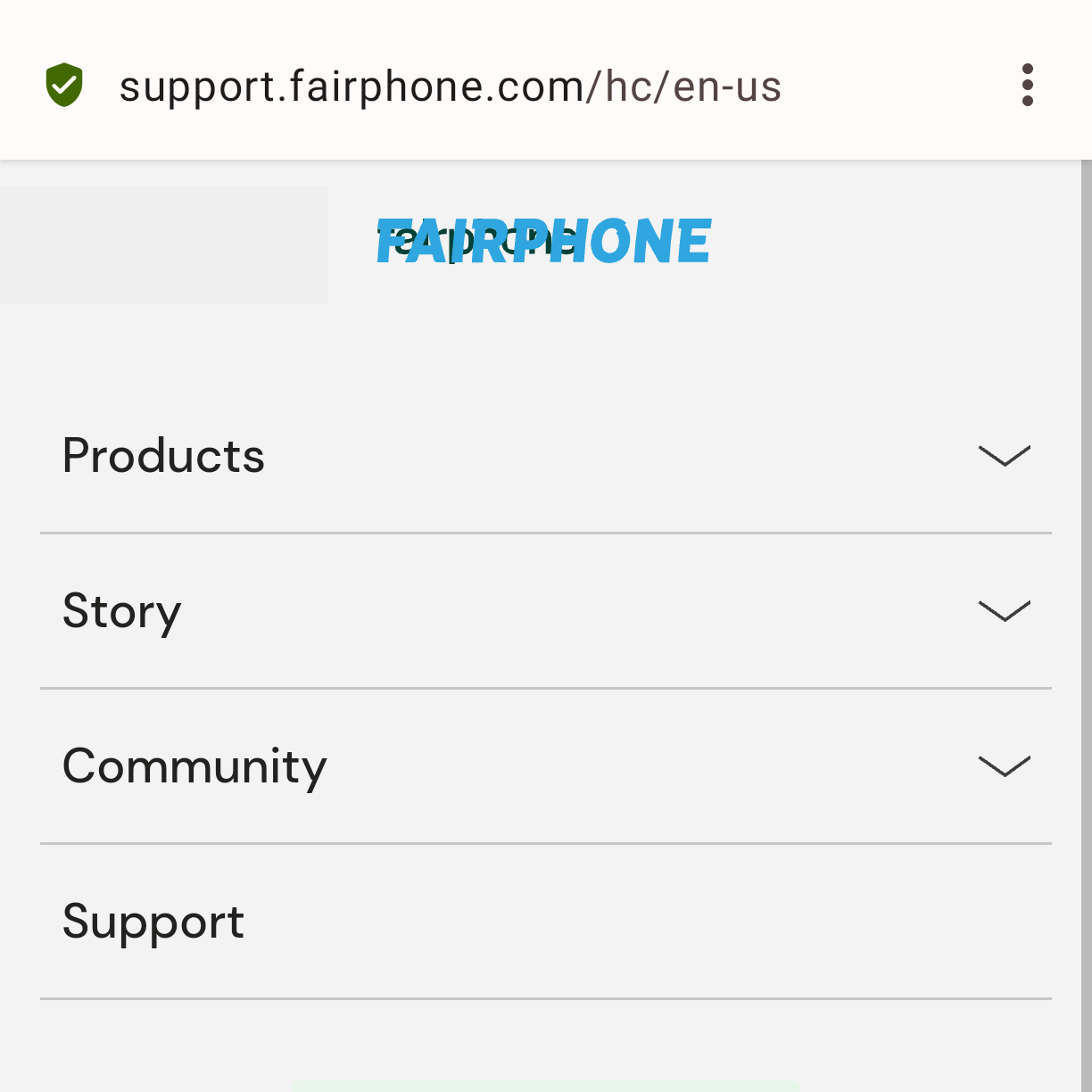
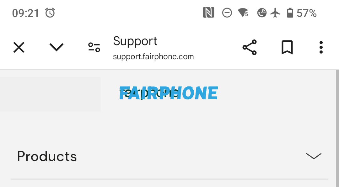
An additional thing I notice: in your screenshot the text color and font still seem to be the old ones.
Maybe a “hard refresh” (SHIFT + CTRL + R) helps?

2 Likes

Looks the same (broken) to me - mobile only, though.

Checked on desktop without cache, looks like @Ingo s screenshot, but then forcing mobile view on desktop also shows it like your broken screenshot.

When cliking on the logo/dark bar (supposed to be menu burger icon?), I get the old and the new logo overlapping

4 Likes

Indeed, looks exactly the same on my mobile Firefox. And I haven’t visited the support page for quite a while, so the cache explanation was my first impulse, too, but seems unlikely in my case.

2 Likes

It’s also reproducible on desktop browsers if you simply reduce viewport width (simply make the window smaller).

3 Likes

Ooer yeah looking a bit off in some pages e.g. customer service with menu open
Using a fairphone 4 with the built in default Google browser


2 Likes

Thanks for flagging this, this is now fixed

9 Likes