Hi y’all. Just want to give you some feedback on a problem I had with the crowdfunding pledge signup. (800K Euros so far! WOOT!!!)
The registration form on my 12" Macbook with Sierra in Chrome, Firefox, and Safari looks like this:
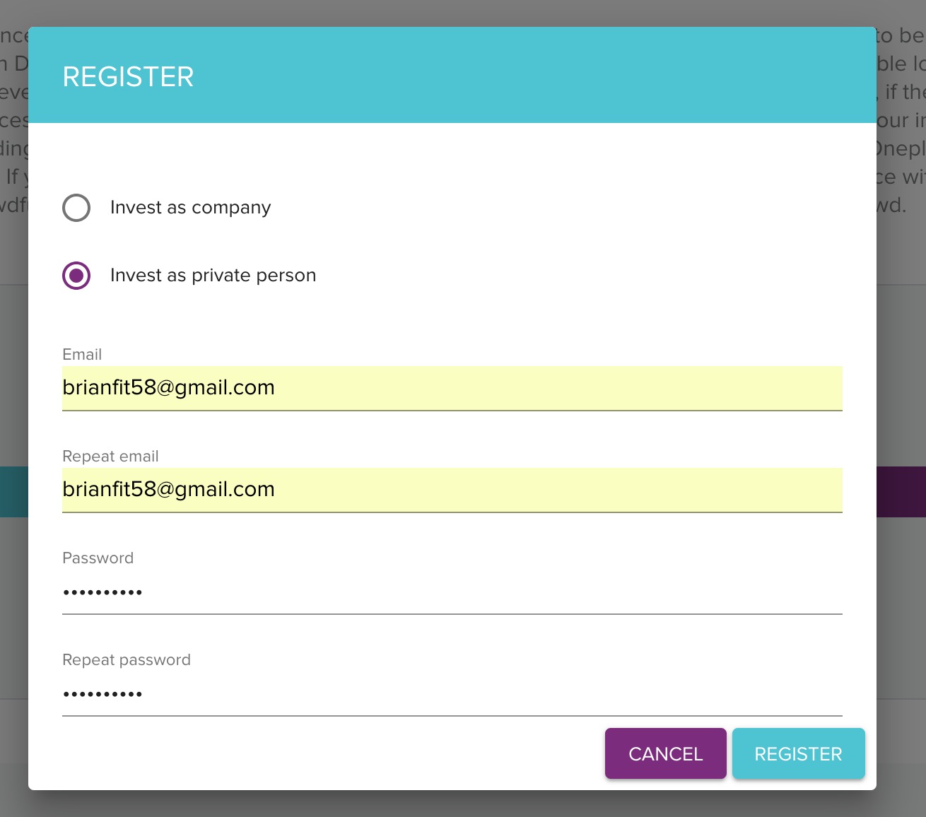
Which if fine. But there are additional check boxes that user needs to scroll to before the registration will work. These are invisible, as are the error messages that inform you that you’ve failed to tick them when you click REGISTER. The effect is that the form SILENTLY FAILS unless you figure out there’s a scroll involved. I suspected my browser and reloaded the page in Firefox and Safari, checked my javascript toggle, then accidentally slid up the mousepad and saw that it was an issue of incomplete info below the scroll. I persisted! Others may not. Might be good to ensure that error messages are visible when the register fails.  Keep up the great work, love you all.