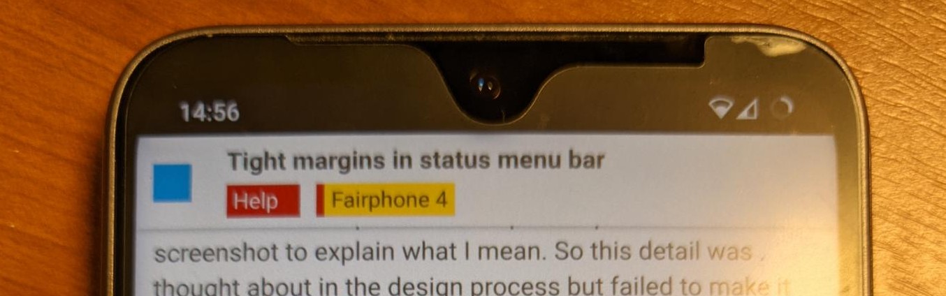
I recently got my new Fairphone 4, it’s absolutely great and looks stunning, a 9 out of 10 experience so far. There is one thing that is keeping me from scoring my experience a 10 out of 10 however, and that is the margin between the top left and top right icons in the status bar menu at the top of the screen. My provider info and battery indicator almost touch the edges of the screen, which feels like a design flaw, like this detail was overlooked in the design process of the Android skin. I feel like details like these can really make a device feel ‘premium’, and this takes away from my otherwise excellent experience so far. When I look on the website however, I see good margins in the status menu in all of the phone mockups. I’ve provided a screenshot to explain what I mean. So this detail was thought about in the design process but failed to make it into the final product it seems.
I’ve tried to look up online how I can manually change the margins myself, this seems to be possible with a command line ADB command (adb shell settings put secure sysui_rounded_content_padding 6). This doesn’t work on my Fairphone however, I suspect that’s because the phone does not run stock Android 11, but a custom version built by Fairphone.
So my request is: could you point me in the right direction of how to fix this issue myself? I’ve requested Fairphone to in a future software / os update, adjust the margins in the status menu bar so they more closely represent the mockups on the website.