Tag colors of FP4 and FP5 are too similar

Hi, Webmasters,

The tag colors of the FP4 and FP5 tags are a little hard to discriminate in some lighting conditions, and (I imagine) for the color vision impaired.

Could you consider giving them more contrasting/different hues at the next site overhaul?

Thanks!

14 Likes

Hi @kraltix ,
Thanks for your feedback!
Actually a change wouldnā€™t have to wait until a ā€œsite overhaulā€ and could be done at any time. :slight_smile: The idea of using yellow (which is really quite close to the FP4 yellow) was to easily distinguish it from totally different topics like ā€œdiscuss->the forumā€, ā€œhelp->accessoriesā€, ā€œhelp->guidesā€ etc.
If the community does prefer to not have all ā€œhelp->device-typeā€ categories in a similar colour but very different ones we can change this.
Maybe you propose a colour (html code)?

2 Likes

This is merely a brief collection of ideas that are not thought out in detail, lest tested with actual colors, it definitely needs refinement.

Theme groups in similar colors is a good additional easing of the navigation mental load. The concept will be kept. Then:

Reserve the range from deep red thru yellow thru deep green for the PFs, say, up to FP8 (more would bring them too close together IMO, and by the time FP9 is around, the site will look very different anyway).

Spread the FPs evenly by perceptual distance, not by #rrggbb. FP1 thru FP4 would probably be close to their current colors (except maybe FP1, below). Move FP5 more into greenish yellow. FP6 would then be at a yellowish green ā€“ you get my drift.

Move Accessories to a hue between Development and the current FP1. Maybe there is enough distance to Development that Accessories can allow FP1 to become a bit deeper/darker red and spread the FP range a little more.

Guides would be some blue-green, but must be darker than turquoise.

Discuss and then Participate could cover the range from deep blue (possibly with light green tint) thru violet.

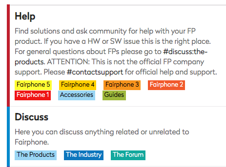
Re turquise: Accessories and The Products are currently too similar, and both have white font on lightly colored background, resulting in low contrast; this will be avoided with the above scheme.


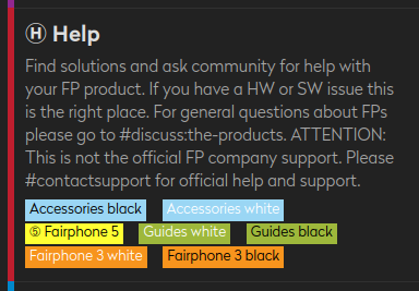
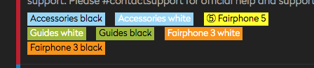
Besides a color coding, consider adding a badge or circled number to the tag text.

ā‘ Fairphone 1
ā‘”Fairphone 2
ā‘¢Fairphone 3
...

The idea can be expanded to circled Initials.

ā’¶Accessories
ā’¾The Industry
ā“Local
...

Do It Yourself would clash with Development, but
ā“ŽDo It Yourself is an acceptable deviation from the rule IMO.

HTH

2 Likes

Iā€™m not yet convinced regarding the badges/circles while I think that a wider color range sounds compelling.

I donā€™t exactly understand this. At the end weā€™ve to use #rrggbb for defining the label colorsā€¦

Can you or someone else give RGB examples?

Badges would make life easier for the more severely color vision impairedā€¦

Sure. But not all equal numeric differences between two colors appear to us as equally distant/contrasting colors. This is a deeeeep rabbit hole.

But if that guy is not lying, hereā€™s the easy path to 24 subjective equidistant colors all around the color wheel. Take the values from the first answer, convert them to RGB, and you have 24 tag colors that are about equidistant to the human perception.

(disclaimer: I have not tested the table values)

1 Like

Actually Iā€™m not sure. For colour vision impaired thereā€™s text on the category labels. And at least for me the badges make it more difficult to read.

Anyway, the colours of the help->model category labels are now spread wider across the dark red - bright yellow colour range.

3 Likes

I was quite sceptical that thereā€™d be a better solution for visually differentiating the five Fairphone generations ā€“ BUT I have to say the new colours (both background and font) achieve the goal very well :+1: The new FP5 yellow isnā€™t beautiful, but it WORKS. :slight_smile: Well done.

2 Likes

Partially agreed. The circled numbers are somewhere between alphanumeric characters and non-character symbols, and should parse faster if they are clearly set off of the text (my first idea did not do that). Then, it would make them more like a symbol or visual marker (e.g., like the user initial top right on the page) A more bold style would also set them off of the label text.

Canā€™t do that in code formatting, please bear with me; also needs vertical centered centered alignment, I donā€™t know how to trick this forum to do that:

ā’¶ Accessories

ā’¾ The Industry

ā“ Local

I donā€™t have research at hand to back up that adding the ā’¶ā’¾ā“ will allow the faster recognition. Only a recent study that could be interpreted taking memorability as a proxy for recognition ease/speed:

https://www.sciencedirect.com/science/article/abs/pii/S0010027723000690

And Googleā€™s test on labels vs labels-cum-icons has unfortunately not been made public, afaik.

Seemingly small changes like that can matter with higher user counts. Google slightly changed a link color once, and ā€œgiven the scale of our business, was that we made an extra $200m a year in ad revenue.ā€

I feel this is much better. Thank you on (presumed) behalf of all who will vgrep skim topics a teensy bit faster.

Can you make the background of Accessories and The Products a bit darker? There is very little contrast to the white font as it is now. Not sure, though, whether adjacent labels would have to shift a little towards deep blue then.

P.S: You already guessed that I am the evil spawn of two teachers, right? :smile:

1 Like

Iā€™ve changed the text color of both category tags from white to black. Is that better now?

That explains a lotā€¦ :rofl:

1 Like

Definitely better to read.

To not base a design on the idiosyncrasies of a single person: What do the other readers of this thread think?

1 Like

One more thingā€¦ :slight_smile:

You can calculate the contrast between colors here:

As an additional info when to decide for white or black text, just calculate both contrasts to background color, and go with the higher one.

I have not looked deeper into this (the German intro linked to in the bottom text at least evokes the impression they know what they are doing :slight_smile: ), and the above idea may be flawed, so donā€™t follow it blindly, please.

2 Likes

I think Help | Fairphone 3 is harder to decypher now with Fairphone 3 in black font. I found white better there. And the same for Accessories, Guides and Discuss | The Products, found these better in white, too.

image

P.S.: @Volker and I just figured out how strongly different these fonts appear in different browsers (and probably between operating systems, too) ā€¦

2 Likes

Strange.The calculated contrasts are these:

background āƆ font āƈ #000000 #ffffff
Fairphone 3 #f7941d 9,2:1 2,3:1
Accessories #9ad6f4 13,3:1 1,6:1
Guides #9eb83b 9,4:1 2,2:1
The Products #9ad6f4 13,3: 1,6:1

(I took the background colors with a color picker; they may be slightly different in the source code.)

There are more factors, though, but I have no estimate how strong/frequent they are among the user base: individual vision (e.g. deuteranomaly), technical setup (monitor gamma, active ICC color profile), environment light.

No idea if you are representative or an outlier.

If more people are not satisfied with the changes, a poll might give an indication of the overall prevailing preference.

1 Like

I, to be honest, donā€™t recall if white letters were better to read; I just can state, that I have no problem reading it now with black letters.
Obviously this might be different on a smartphone; though I canā€™t tell since I only ever attend the forum on my computer.

1 Like

These are the two simple screenshots that convinced me and @Volker that itā€™s not just about personal differences of taste, but that browser and operating systems simply display stuff in different ways:

grafik

image

Note the difference between the white font in the upper screenshot (Volkerā€™s system) and the lower screenshot (mine).

2 Likes

That is less the color effect than the stroke thickness aka weight. Devices/OSs/Browsers have different default fonts and may even render identical fonts slightly different resulting in differing subjective perception. E.g., here, the size in pixels (ā€œGā€ top-bottom) is equal ā€“ but appears to be not.
2023-10-27_17-10-32
2023-10-27_17-10-44
Unless the web designers want to test with a vast variety of renderings, they are powerless against the whims of the device designers and programmers.

Sidenote: It is usually recommended to increase weight for light script on dark background. Otherwise the font looks ā€œtoo thinā€. Antialiasing eats at the thickness, too, which affects the thin lines more.

2 Likes

This topic was automatically closed 180 days after the last reply. New replies are no longer allowed.