I was thinking that the entire color scheme can use some attention… but I’d hate to force you to update your avatar again.
Don’t worry, I have it saved as a .psd that can be edited quickly. 
1 Like
Oh you already started.
I like the new #fairphone2help red, but I think #fairphone-help should stay some kind of red too.
And how about #market white, #market:wanted pastel-red and #market:offered pastel-green?
I am trying to adhere to the official color scheme as close as possible…
The idea I now follow is that each main category has a prime color, and subcategories are shades from that prime color.
4 Likes
Like this?
![]()
1 Like
Yeah now it looks great. 
PS: I’ll probably have to update my avatar again soon, as the #market will surely move up soon.
PPS: @Douwe maybe one little tweak: Could you change #software:fp2-android-5-1’s and #software:fp-open’s colors? Open OS shouldn’t look pale in comparison to FP OS! 
1 Like
It’s not pale, it is more… open ![]()
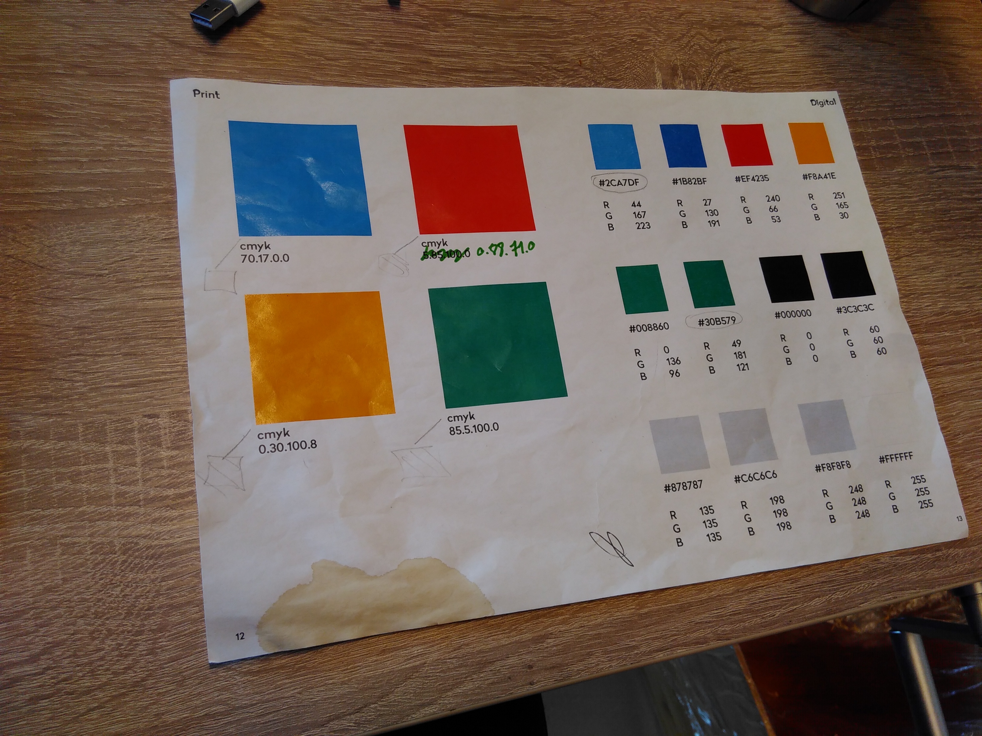
What about that coffee stain color at bottom for the Help category? 
3 Likes
Do you remember when #community was called “Fairphone Café”? The colour was meant for that category.
3 Likes
I like it! Much brighter now ![]()
1 Like
This topic was automatically closed 182 days after the last reply. New replies are no longer allowed.