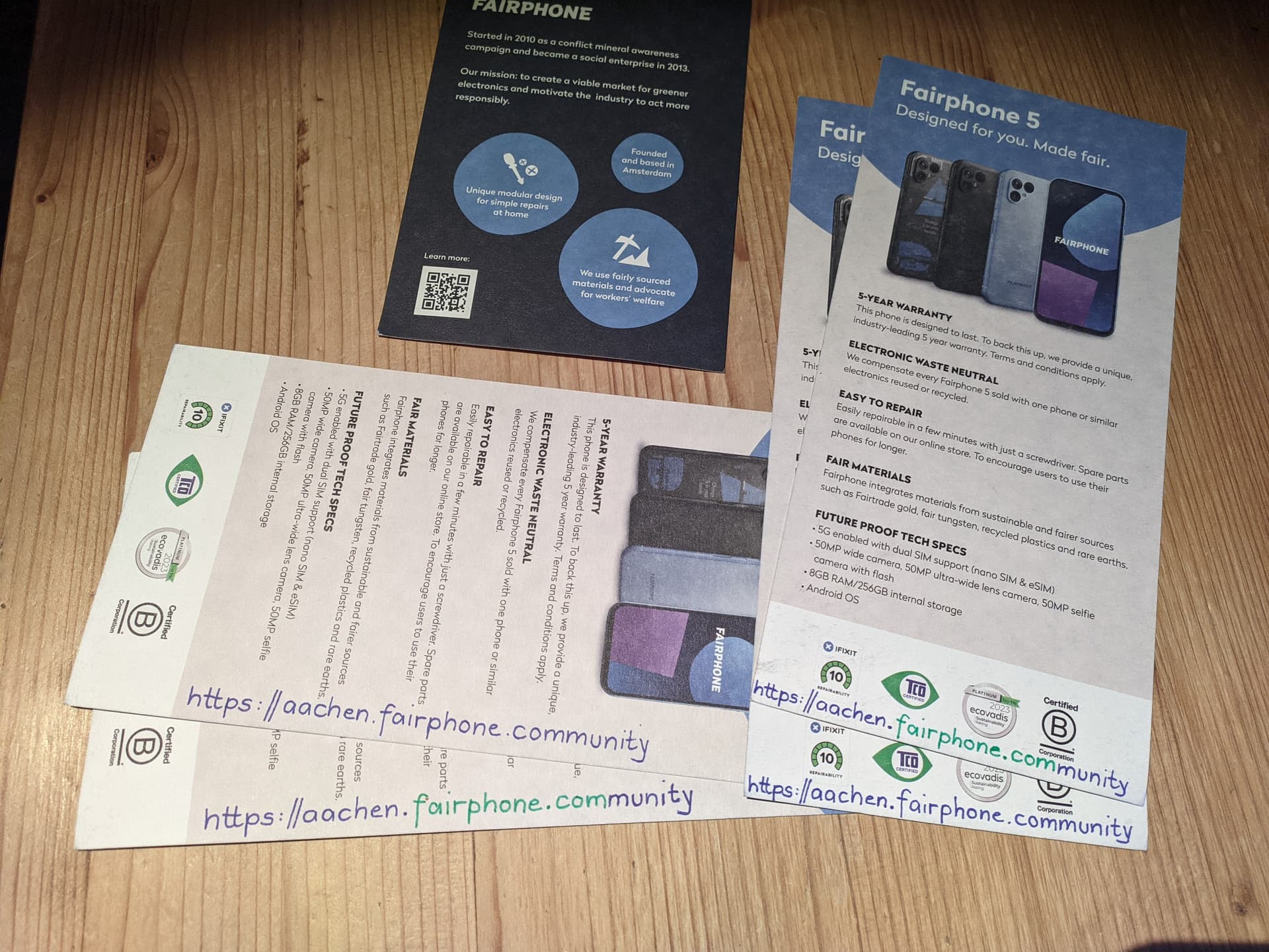
For a few years, I have been – manually – adding our local community URL https://aachen.fairphone.community on the writable back side of the Fairphone stickers we have been giving out on our local Fair Trade Fair and on other opportunities and events.
Now I have just received a new bunch of FP5 and FP4 flyers from Fairphone and have found those “writable” as well. So I am planning to add our URL on them as well. In addition to our local URL I would like to add the general https://fairphone.com URL as well (it is not printed directly on the flyers, just hidden in a QR code and even this only on the FP5 flyers).
Now I wonder – before I add the URL to more flyers – if this is too complicated and confusing for the recipients of the flyers. Do you think they will fail to find us online this way? Or do you think it’s sufficiently evident that we are spelling out two URLs in one?
Although I like the idea to do it that way, I’m pretty sure I would never notice 2 URLs and just wonder about the different colours…and I think people will just use Google or so and search for Fairphone
The idea is nice, but I’m also pretty sure that many people will miss the double meaning. I’m not sure if I would have understood it if not already familiar with the URLs.
I’m also not too worried about people not finding “fairphone.com” by other means. So I’d limit it to the community address.
The only argument that I could make for this dual design: It would be more likely the “fairphone.com” URL that is overlooked - and that is the less important one if my reasoning above holds up.
While I’m not happy with the exclusive QR code (I believe for basically just 13 characters it’s making things more rather than less complicated), I’ll just write https://aachen.fairphone.community in all blue on the long beige/greyish margin (like on the flyer on top of the over in the left half of the photo). Will just leave out fairphone.com – I find that adding it separately somewhere else will spoil the esthetics of the thing too much.
The https:// part isn’t beautiful, but I think it is really necessary for understanding. I guess almost everyone of you has already found people doubting that .community is a real top-level domain. So the https:// signifies “YES! This IS a web address”.