Hi and welcome, and no currently its not possible.
2 Likes
That’s sad, but let me say, the old times are definitely over and don’t coming back.
You would have to get used to it.
Google is going the way of Material You.
If you could change the clock to one line, its still material you and the old style.
By the way, i love the new gui style ![]()
It always has been like this. The reason Android 12 has more padding on the right now is because it’s reserved for the camera/mic indicator. The FP4 has very dramatic rounded corners which make the UI a challenge. I really hope they won’t make these same rounded edges in the screen on the FP5, it cuts off too much of the screen for no reason. When you switch to landscape mode you’ll see even worse screen space issues.
4 Likes
But they could at least add some padding to the left, like all the custom ROMs have had for ages!
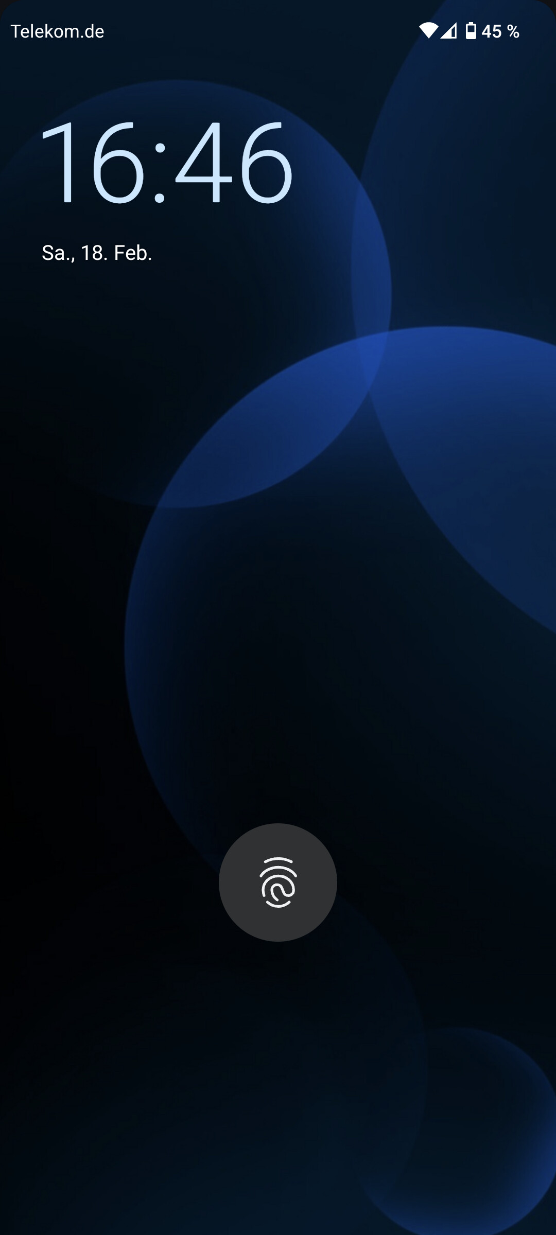
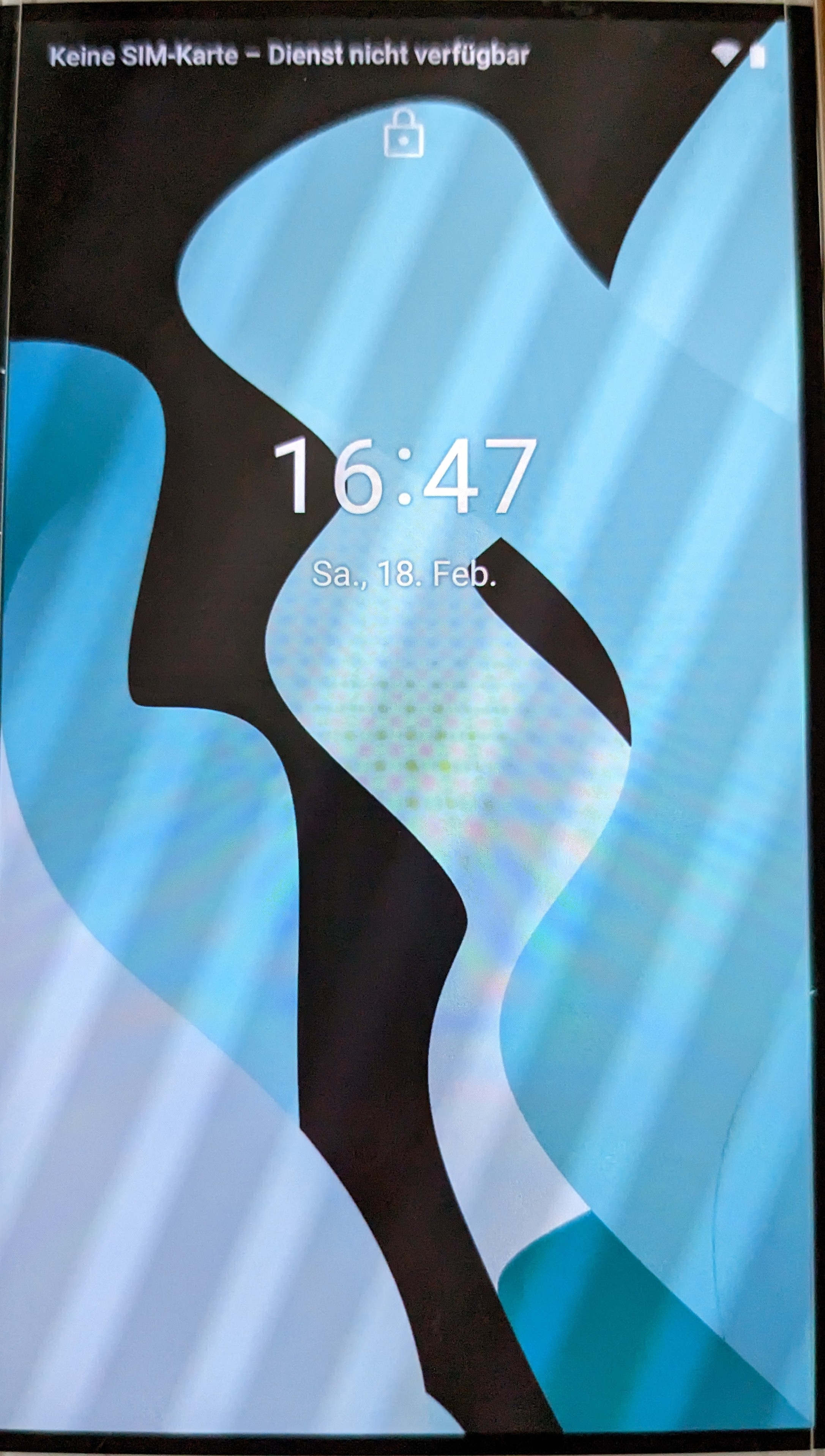
Can’t be that hard not to cut off the clock …
6 Likes
You have to charge you battery ![]()
5 Likes
I don’t know if that will solve everything. I think the FP4 design choice with those dramatic corners will always give you a bad UI. Adding padding means you have even less space at the top bar since the notch also chews off a big portion. I really, really hope the FP5 will be designed a bit more practical.
It does take away space, but at least it’s symmetrical, the clock almost touching the black border just looks awful ![]()
Charging already in progress ![]()
7 Likes
It will solve one thing and create another issue in terms of space is what I mean. The right area is also cut off sometimes when too many icons are enabled, it drops the % symbol and battery percentage. That’s what I mean with that padding won’t solve everything, it will create other issues. The FP corners will always give a bad UI due to its impractical design.
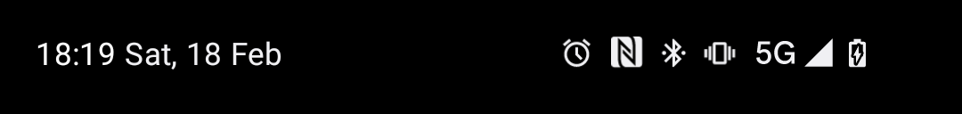
Well - rounded corners are ok as long as they are taken into account for the UI. They would just need to move the elements bit more inwards so they are not nearly cut off by the corners. Or is a layout change not possible without loosing the official certification by Google?
I have seen other devices with nearly identical rounded corners which manage to position the notification bar elements and lock screen shortcuts properly. It’s just a simple matter of moving elements around 8-16 pixels inwards, nothing else.
4 Likes
Which devices exactly? The only solution for the FP4 may be to make the icons and fonts smaller in the notification var. But then again, solving one thing and creating another issue.
On left side, its just 8 pixel to the right. That’s it.
Not more, not lrss, just 8 pixels
Xiaomi Mi 9 Lite for example - and no, the icons and fonts do not need to be smaller, just a bit more inwards with a slightly bigger margin to the left or right.
1 Like
And then have less space for icons ![]() Which is already a problem.
Which is already a problem.
On the right side there is enough space for about six icons even with the battery percentage display turned on - which is total sufficient to indicate the activationof NFC, WiFi, Blueteooth, mobile network, vibration and battery status.
There should be enough space for 5-6 icons on the left side as well when you disable the carrier name even with a little margin to the left.
Also the important thing here is not to cramp as many icons as possible to the notification area. For notifications it is enough to indicate that there is a notificatoin at all - and if you want to see what kind of notification, you just pull down the notification drawer.
1 Like
You’re forgetting a clock ![]()
No, I have taken the clock into account.
Seriously: the space in the notification bar is limited anyway. So talking about how to get as many icons as possible there makes no sense at all. The real solution should therefore not be to have as much space as possible but how to use the given space in a useful way.
5 Likes
In addition: when pulling down the notification drawer, you can clearly see that the clock moves a bit to the right which fits much better to the rounded corner. This how it should be in the normal view as well:
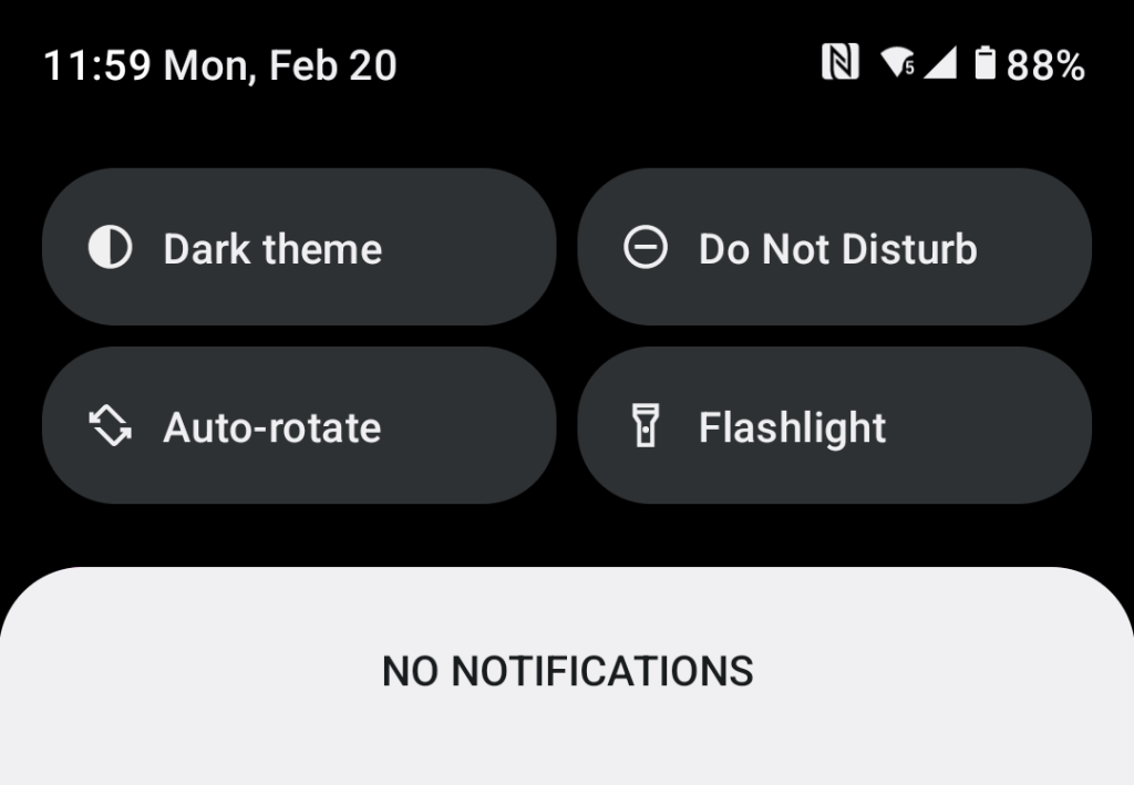
If you only display the time (11:59) there is still enough room to display multiple icons. And as I already explained: it’s not important to have many icons there but only an indication that there is a notification at all. Unfortunately Fairphone did not include a notification LED in the display which could serve exactly this purpose.
Ireland Vodafone here reporting successful upgrade to Android 12. Congratulations to everyone involved on a super job!
3 Likes