I’m not sure if it’s always been that way but I struggle with the mark as solved button’s position on mobile:
It’s especially hard to hit the like counter to check who has liked a post without either hitting like or selecting it as a solution.
I remember it being in the overflow menu, but I might be wrong.
Am I the only one who keeps hitting that button by accident? 
I cannot recall hitting the Solution button accidentally, but “Show Likes” and “Like” are easily pressed accidentally in my experience, too.
I hardly ever get on the forum using the phone, almost always desktop computer.
2 Likes
I used to access the forum exclusively from a PC up until recently, so I’m really not sure if it’s always been that way, or if that was introduced with one of the more recent design changes
I didn’t have the issue on PC, but I mostly use the keyboard shortcuts to navigate the forum and like things …
1 Like
Maybe the “Like counter” feature could be relegated to overflow, or a bigger space left between “Solved” and “Like counter”, after all there’s room.
I’d prefer the mark as solved button in the overflow (if one has to go), because from the buttons there it’s by far the one I need to use the least amount of time.
There’s usually only one solution in a topic, but a lot more posts with likes.
3 Likes
Frankly, for my usage I would not need a change here. An accidental Like can be easily reversed (and accidental “solved” markings, too). I for my part never used the chain link icon (instead, I click on the time mark at the top right of a reply for that purpose), but its prominent position doesn’t bother me either.
But let’s see if there’s more feedback from those using the mobile version more frequently.
2 Likes
I know it’s a bit of an insignificant issue, but it stressed me out enough to open my first topic, it’s kind of one of those buttons labeled “Don’t press” 
Yeah, let’s see if others can’t manage to hit that touch target either.
Does that button even show up for people in all trust levels?
I almost always use my phone to enter the forum from the beginning and I’m used to be very precise when I want to like something, so I do not often hit solution by mistake I think. Still moving the solution button into the overflow would be a very good solution in my eyes.
3 Likes
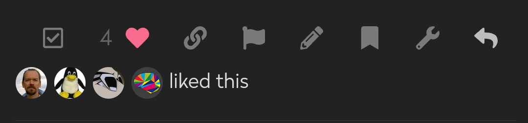
One can see who has liked the post by pressing the three dots.
It’s not an obvious solution, but it works once you have found it.
5 Likes
Good find  Works both on desktop and mobile.
1 Like
That works, but I find that menu even more stressful …
… especially since there’s no way to close it again

That’s basically where all the “Don’t push this button” buttons are 
3 Likes
Page reload.
While I can relate to minor things just being stressful nonetheless, this can alternatively be approached by trying to deliberately be a little more forgiving  .
.
1 Like
I know it’s a small thing and I’m probably alone with that issue, but it legitimately stresses me out.
I am very careful not to make mistakes or bother people, so a button that pops up a notification on someone else’s screen when pressed by accident makes it harder for me to use the forum.
That is certainly not something most people think about, but it is a problem for me.
1 Like
I’m all for improving the forum experience, if possible. And the internet should teach anybody pretty quickly that it is pretty hard to be the sole, lone person thinking in a certain way about something.
The world is imperfect, all beings are imperfect, humans will err.
I don’t want to err, you don’t want to err, but I will, and you will.
I will not pretend that I cherish my own imperfection, but there’s no choice other than accepting it to avoid a totally futile and probably harmful struggle.
How about Wabi-sabi-ing the problem?
The button placement can be accepted (if not cherished) as an imperfection of the forum, which will never be perfect anyway and thus resembles the default state of the world and ourselves.
Receiving a notification out of an erroneous button press by somebody else can be accepted (if not cherished) in the same way, if people on the receiving end even want to think about it and don’t just immediately shrug it off as a software glitch. Either way, I have yet to see anybody making any kind of deal out of such a mis-notification.
We don’t even need to make a meditation of it. As we know the concept, we can just point at an imperfection we see and just nod and say “Wabi-sabi.” … and it might already be very hard for the subconscious to get a stressful sting out of this … whose subconscious doesn’t like the conscious to say “Wabi-sabi” out loud  ?
?
Of course there needs to be a balance. If everybody just accepts everything as imperfect as it is, improving things becomes moot, but a drive to improve things is needed, too. So, this topic is fine and valid for this. Perhaps something can be done.
If not … I won’t judge anybody’s stress level on this as long as everybody else don’t judge my stress level seeing people not bothered in the slightest when their own posts and sometimes topic titles (for crying out loud) in internet forums look like their cat ran over the keyboard when typing .
1 Like
I do agree with you that in general the best approach is to accept things you cannot change.
In this case I don’t even have to accept it, I can just block the element with uBlock or write a userscript.
For me this is less about how it looks (even though seeing a button you shouldn’t press does make it harder to focus on the context), and more about what the button does.
It might not seem like it, but I do suffer from social anxiety. So while I’m absolutely sure no one cares if I press it accidentally, potentially causing attention to myself is deeply stressful. There’s a reason I generally don’t open new topics.
I don’t expect the forum to change around my needs, especially since I can fix it myself, but I still wanted to bring it up in case others feel the same way about that button 
Edit: Here’s a uBlock filter that hides the button but keeps it available in the overflow menu and still shows the green  Solution label on a reply selected as a solution, maybe someone else finds it useful:
! Remove mark as solved button for https://forum.fairphone.com
forum.fairphone.com##.collapsed.post-controls > .actions > .extra-buttons:has(.unaccepted)
3 Likes
This topic was automatically closed 90 days after the last reply. New replies are no longer allowed.