It would be great if we could choose the old theme for mobile and the new one for desktop. I like the new theme (haven’t tested it with the thinner font), but it has many flaws in the mobile version.
It’s better to read, but the solution mark and pin icon is in the middle of the text.
Browser Firefox mobile.
Dosc
Yeah on mobile there are still issues.
we hope to resolve them soon
2 Likes
The mobile forum experience just got a lot better. Now I can see the title of the topic I’m currently in, before that bar was empty on mobile.
2 Likes
Thanks for changing the font-weight. Looks great now on my Linux Computer. 
1 Like
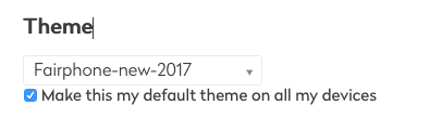
Yep, it’s better now. (And it seems to be possible to use a theme only for one device by removing the checkmark next to the theme selector.)
Creating a topic is still a pain though:
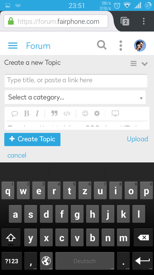
It would be great if we could choose the old theme for mobile and the new one for desktop. I like the new theme (haven’t tested it with the thinner font), but it has many flaws in the mobile version.
Did you try unticking the option to use the theme on all your devices?
1 Like
Thank you, I’m using the new theme on all devices now. I hope the topic creator gets fixed soon.
This topic was automatically closed 182 days after the last reply. New replies are no longer allowed.