I’m taking a course called “thematic cartography” at university and the professor asked us to create two maps. I chose the Fairphone community as target group and now would like to ask you for your feedback:
Just a quick feedback (just had a glance, so sorry if I got something wrong):
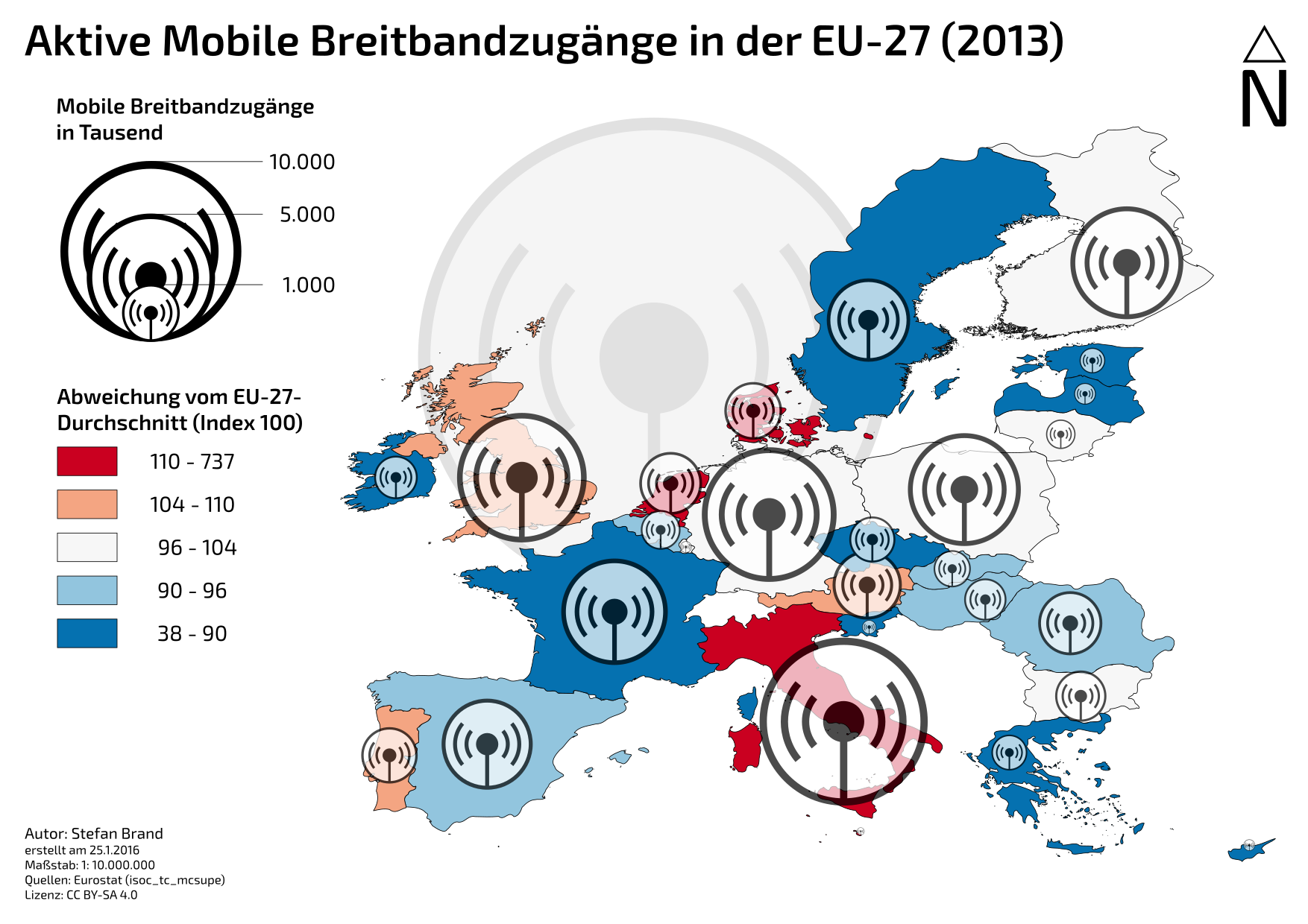
As you have symbols to show the absolute quantity and colours to show the relative quantities, I would use a “normal” map and no cartogram. I felt a little irritated by the shape of the countries (and I believe it is hard to see which country rose/shrunk about how much). Maybe use the symbols or other symbols for relative (to e.g. inhabitants) quantities as well as the absolute quantities might not be that relevant (depending on what question you want to answer).
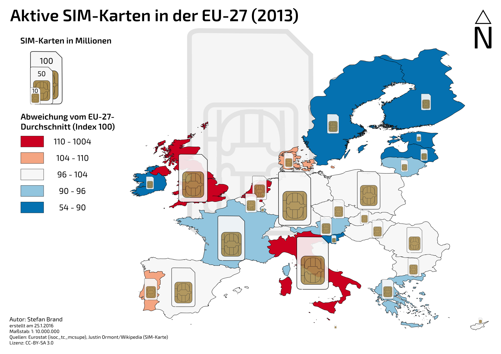
It is difficult to use colours for a scale. It is not intuitive for humans that red should be more than blue, or the other way around. It often works better if you only use different brightness or saturation levels of the same colour.
White seems to be neutral (e.g. two coloured levels below and above it), but is actually used for values from below up to the median. Shouldn’t it be e.g. from 96 to 104?
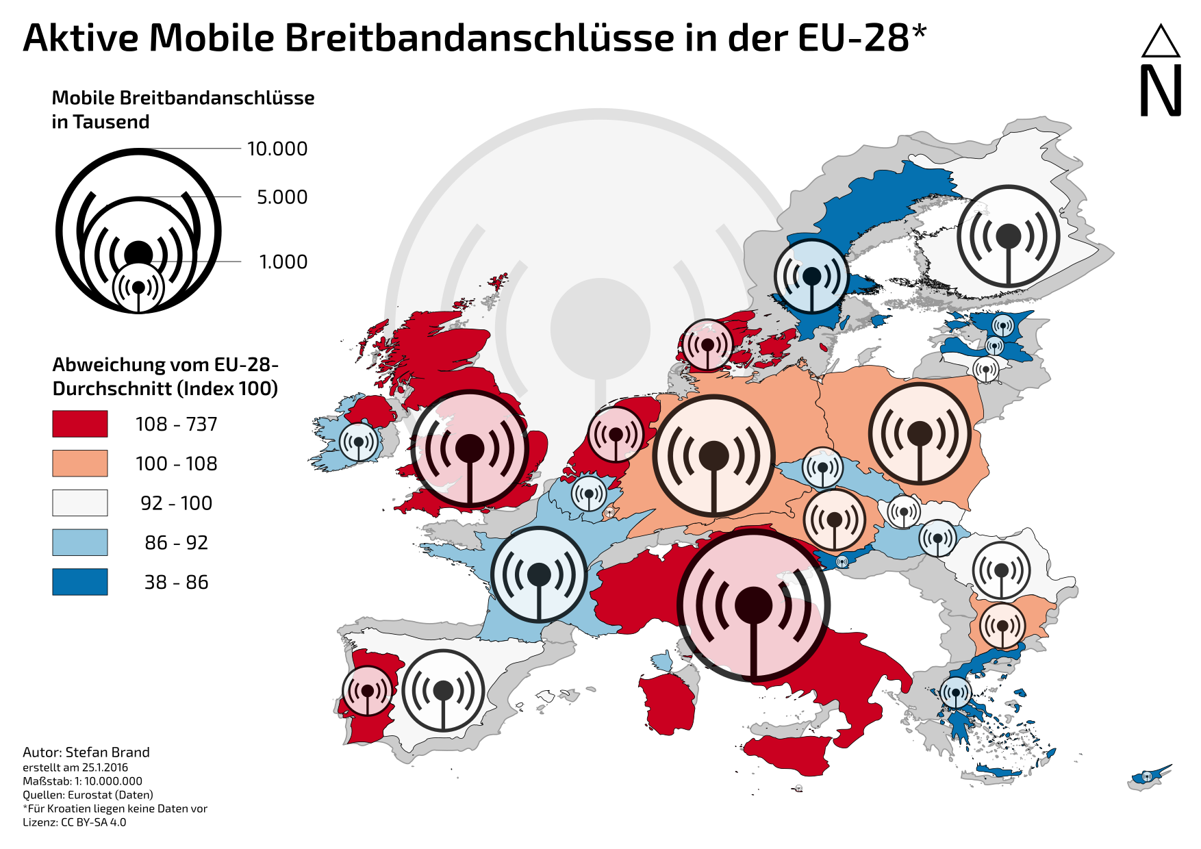
I wanted to display the deviation from the average (=100), thus the diverging colour palette. We learned that this is appropriate.
Probably, thank you! Actually I chose an Equal Count classification, to make the extremes stick out more.
The colour actually represents the size error (more than the average is bigger, less is smaller). Initially I chose cartograms because the description of the exercise said that I then would only need one data layer. I have two now (absolute and relative), so that’s kind of obsolete…
I’m formulating a question now (I know, one should do that at the beginning… ;)): How homogeneous is the European mobile telecommunications market?
The distorted countries are very irritating. I asked myself what these blue areas in Scandinavia are. I think the map is (more) unterstandable with real-sized countries.
+1. But I think it’s OK to use blue colours for values below and red colours for values over the average.
The SIM card images are OK (if the surface area correlate with the number of SIM cards).
I think you should provide a definition for “aktiv” and “mobiler Breitbandbandanschluss”. Maybe you can name it for example “Im Januar 2016 genutzte UMTS/LTE-Datenverträge in der EU-28”, so you also avoid “Anschluss” for a non-physical, wireless connection.
I find one can confuse the “number of mobile broadband subscriptions” with the “quality of the mobile network”, so one can believe that the mobile network in Sweden would be bad.
@sjjh@TobiasF thanks again for your feedback. Since you both were irritated by the cartogram, I exchanged it with the real map. Here is the new version:
Probably I’m still too tired but I don’t get the “Abweichumg vom EU-27-Durchschnitt” part. What exactly does that tell me?
The symbol is for absolute numbers in a country for SIMS/Breitband in 2013, right?
And the Abweichung is from what exactly? The average of SIMS/Breitband averaged for each country with absoulte numbers or for Anschlüsse per people or what?
Sry, probably I just don’t see it.


